Every column on its own terms
Percentages, raw counts and timed measures keep their own units and direction. No composite score, no rank.
Report workspace
Choose a saved format or create one for a new kind of assessment. Your data, benchmarks, charts and wording stay together from upload to download.
Percentages, raw counts and timed measures keep their own units and direction. No composite score, no rank.
Set a target per column and choose whether higher, lower, or neither is better. Colour and wording follow automatically.
Choose the section headings, turn sections on or off, and add your own opening and closing paragraphs.
Quick start
New report
Step 1
Templates define columns, charts, benchmarks and wording. They do not contain your current data.
Step 2
Upload a Word, Excel or CSV table, or begin with an empty row.
Step 3
Confirm rows and chart settings before generating.
Set up the assessments taken during the year, then upload each class’s results for every assessment. The data you already imported is the first class at the first assessment.
Listed oldest first. Every class is compared at the same points in the year.
Add at least one more class. Each class needs results from at least two assessments.
Add each assessment from the year. The data you already imported is the first one. Students are matched across assessments by name.
Listed oldest first. Growth is measured from the first assessment to the last.
The data already imported is the first class. Add other classes using the same assessment template.
Add at least one more class. Row order and student names can differ between classes.
Choose the key numbers shown in the bar at the top of each student’s page.
These settings change how the written commentary reads. Every number, benchmark and chart stays exactly the same.
Turn a section off to leave it out, or type your own heading.
Set a target for any column. Values that miss the target print in red; values that meet it print in green. The direction also tells a growth report which way is progress.
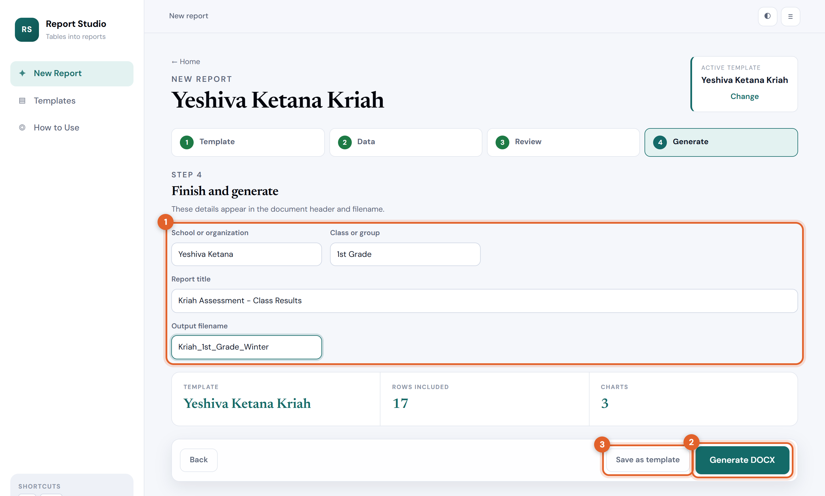
Step 4
These details appear in the document header and filename.
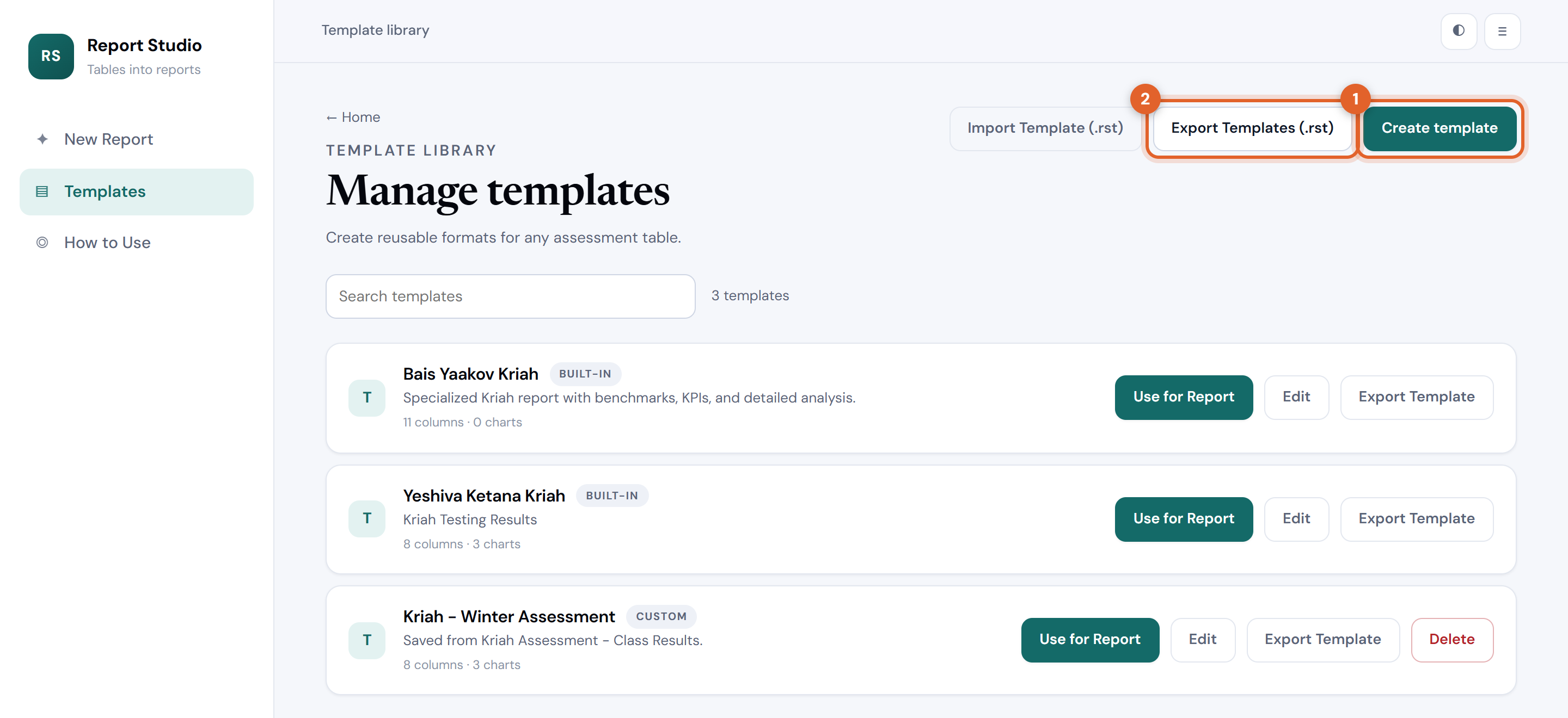
Template library
Create reusable formats for any assessment table.
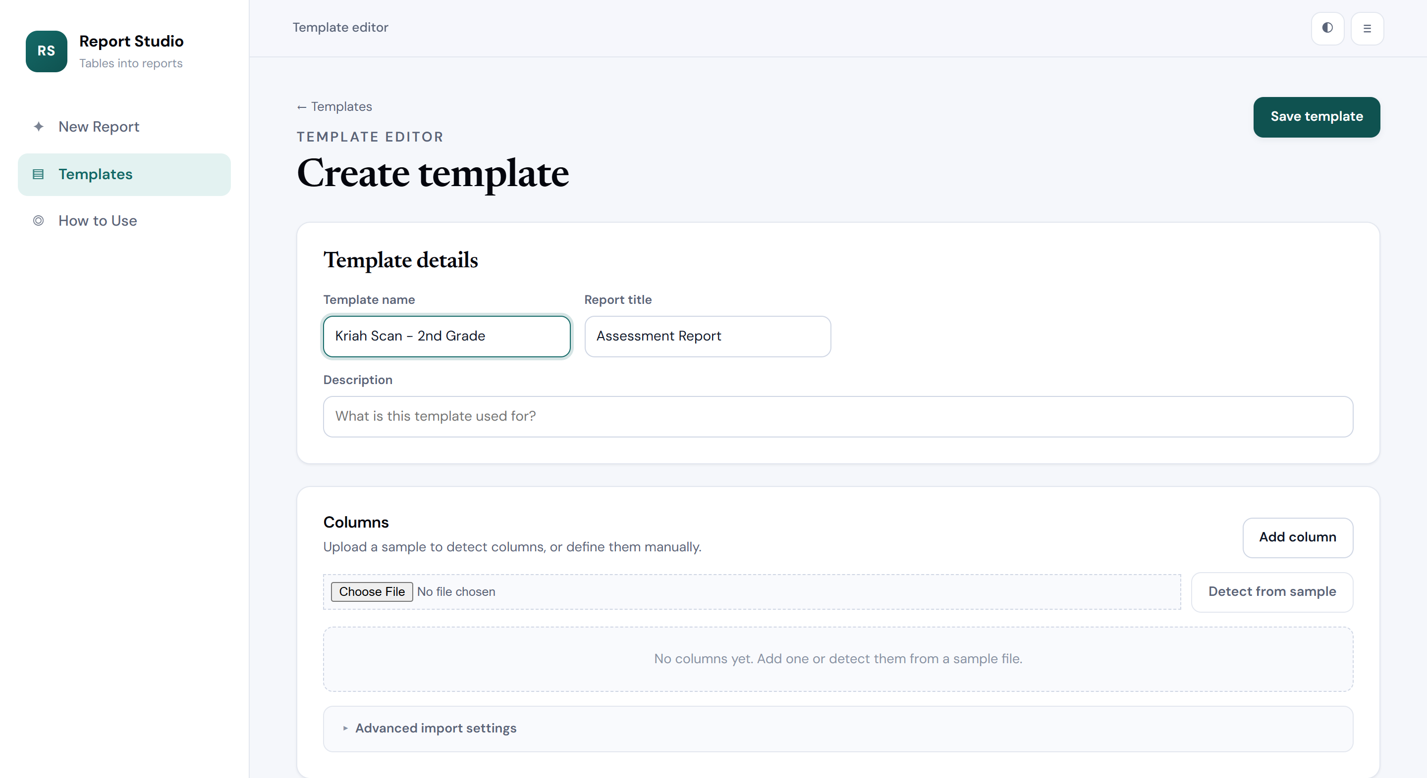
Template editor
Upload a sample to detect columns, or define them manually.
Choose the figures that appear in the highlighted bar at the top of every report.
Charts can still be changed for each report.
Starting point for the written commentary. Every report can still change it.
Printed under the results table. You can edit or clear this for each report.
How to use Report Studio
No formulas, no formatting, no fighting with tables. Upload the marks you already keep, choose what the report should say, and download a document you can print, email or file the same minute.
Choose the right shape
The same imported table can produce any of these. You choose in step 3, so you can generate several from one upload.
The whole class on one sheet: a summary bar of headline figures, the full results table with every value coloured against its target, your notes, and the charts you choose.
One page per student with a progress bar for every category, the benchmark and class-average lines, strengths, focus areas and your private note about that child.
Add each assessment from the year and the report shows the trajectory per category, who improved, who slipped, and how many targets are now met — for the class and for each student.
Several classes side by side, with class profiles, strengths, priorities and target attainment. Three finished styles: visual comparison, detailed executive analysis, or a chart dashboard.
Every category keeps its own units and its own direction. Seconds stay seconds, percentages stay percentages, and “fewer mistakes is better” is respected everywhere. Report Studio never invents an overall score or a class rank.
Walkthrough
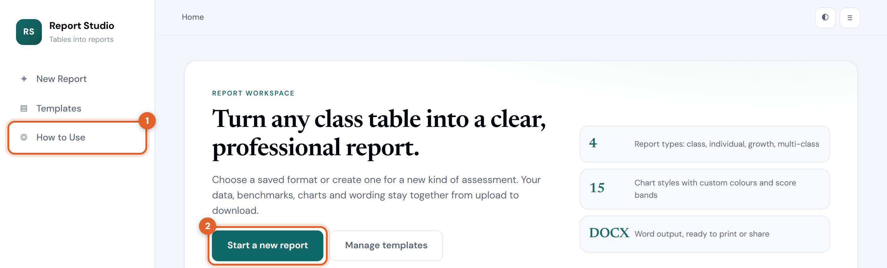
Numbered rings in the pictures match the numbered instructions beside them.
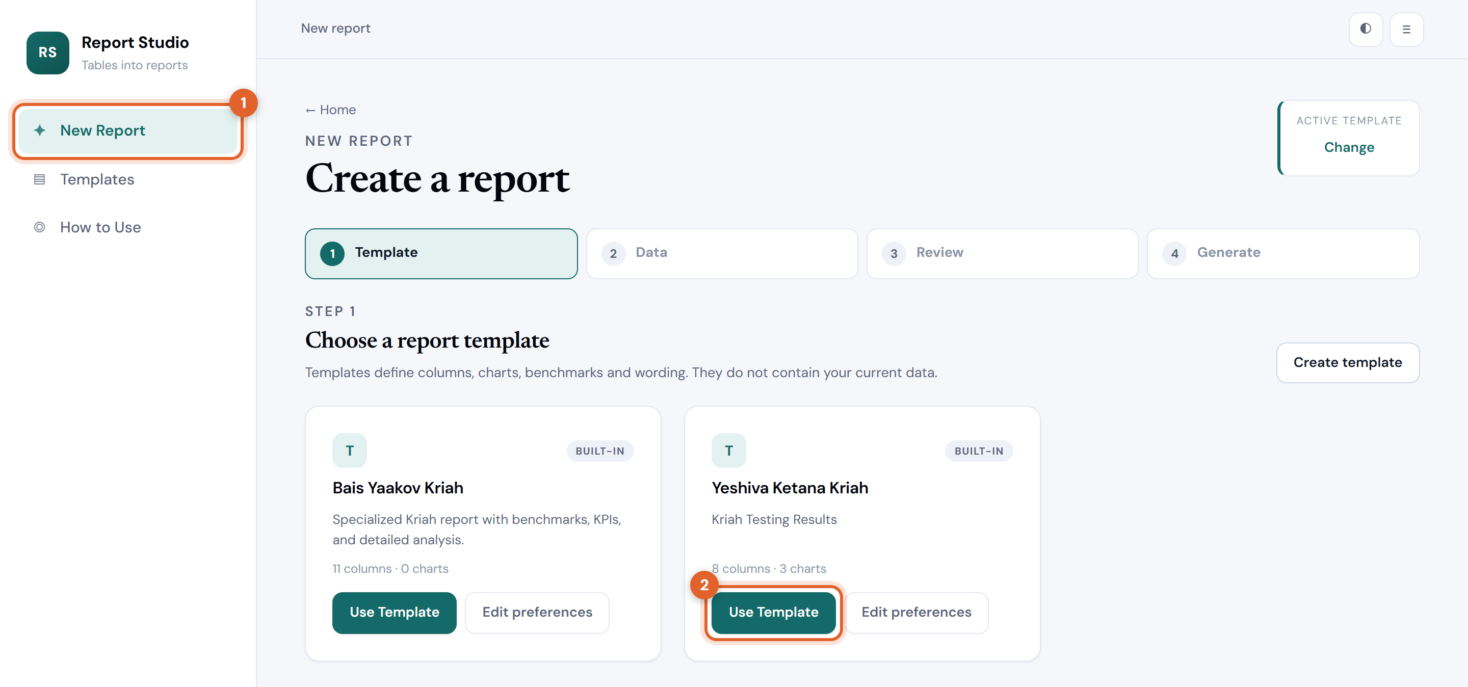
A template remembers the columns, targets, charts and wording for one kind of assessment. It never holds your marks, so the same template is reused every term.
The template you used last time is remembered, so returning users usually land straight on step 2.
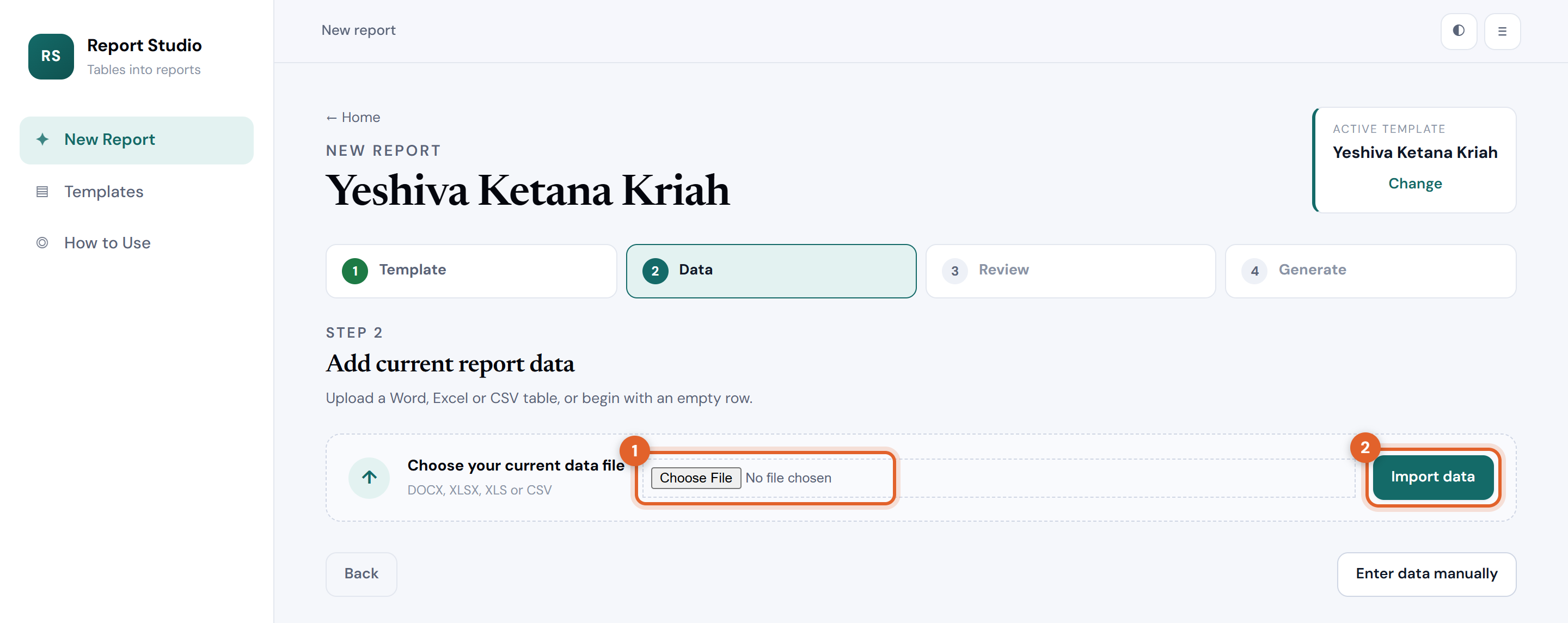
Bring in the file you already keep. Word tables, Excel sheets and CSV exports all work, and headings do not have to match the template exactly.
Summary rows such as “Avg. Nov. ’25” at the bottom of a sheet are recognised and left out of the class statistics.
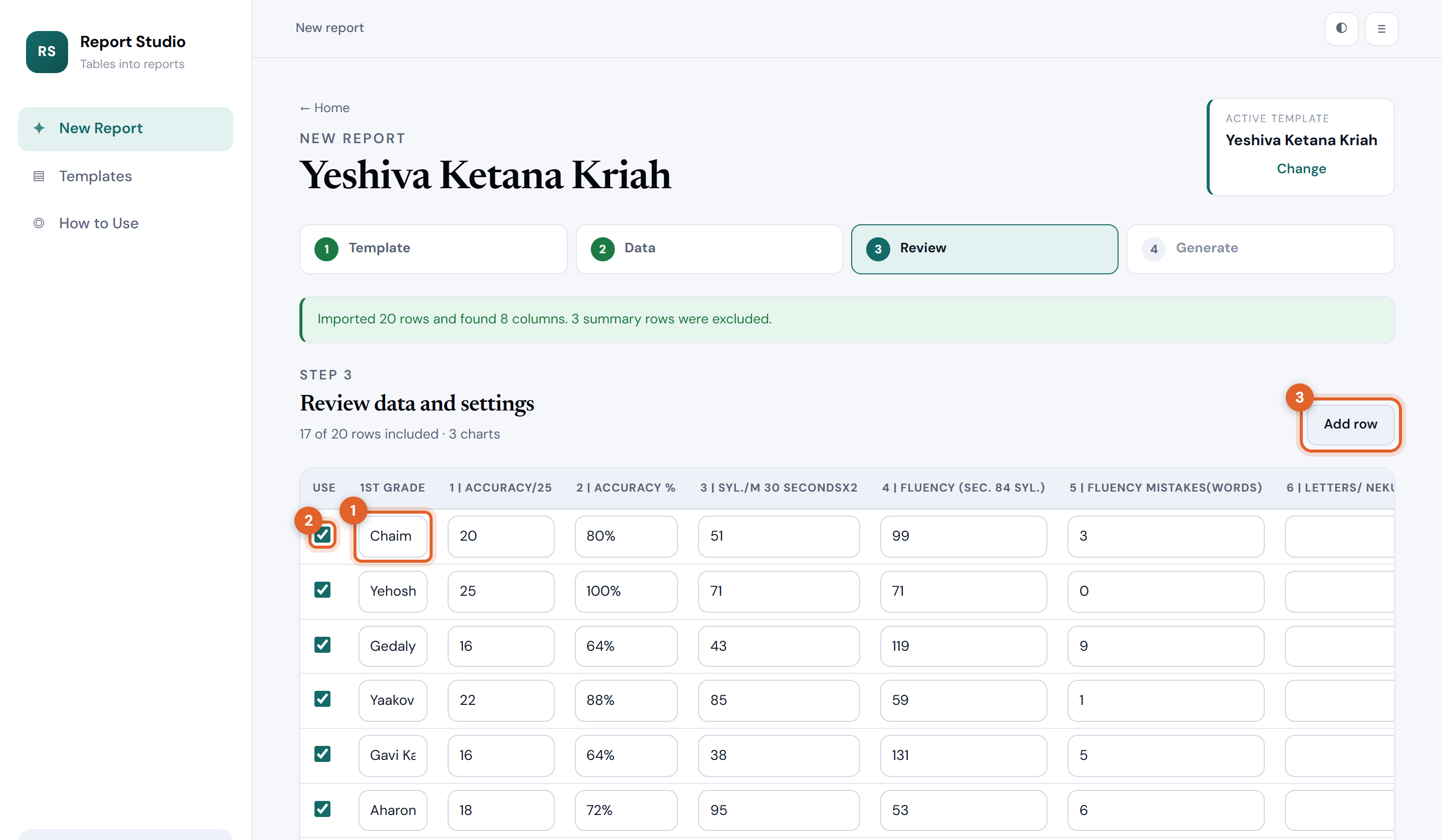
Everything imported appears in an editable table. Fix a typo straight in the cell, untick a student who was absent, then work down the panels underneath.
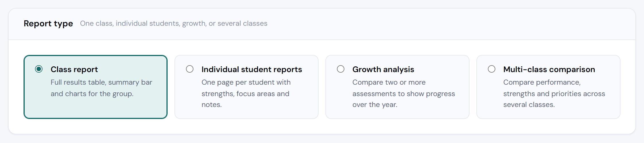
Pick class, individual, growth or multi‑class. Choosing growth or multi‑class reveals an extra panel where you add the other assessments or classes — one upload each, same template.
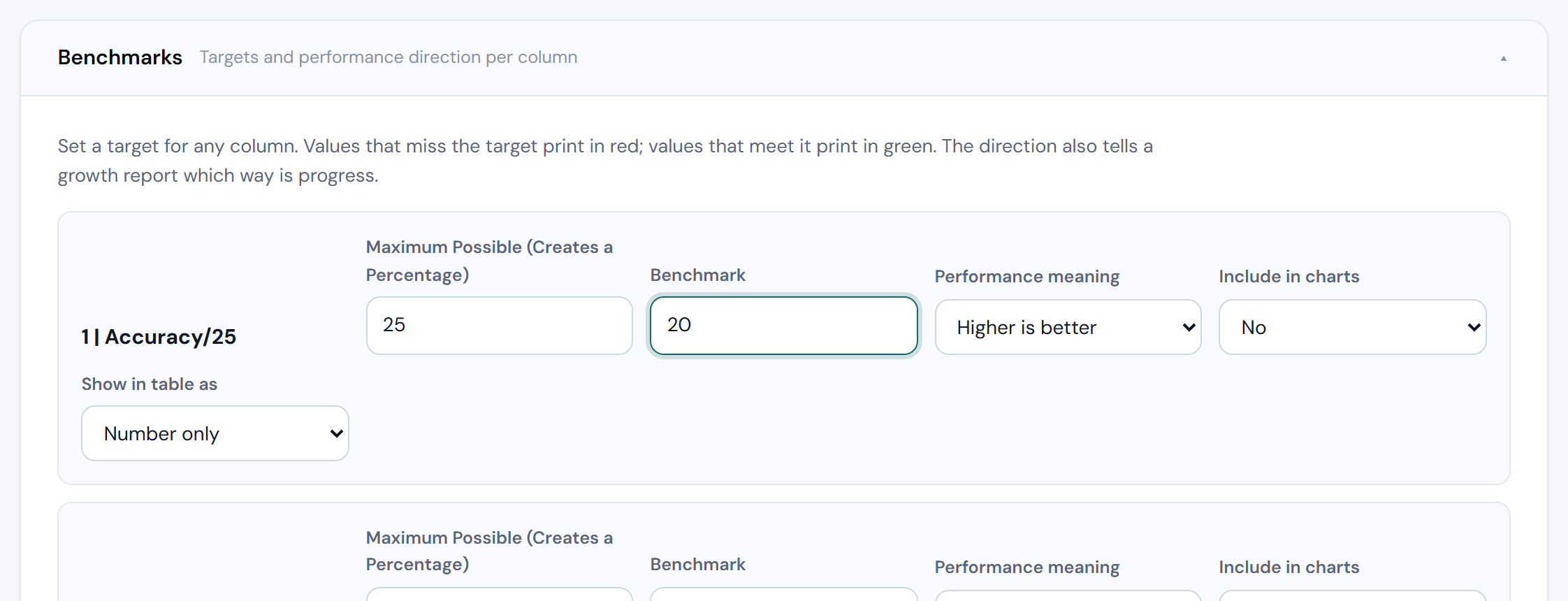
Give any column a target and say whether higher or lower is better. Results that miss print red, results that meet print green, and growth reports use the same direction to decide what counts as progress.
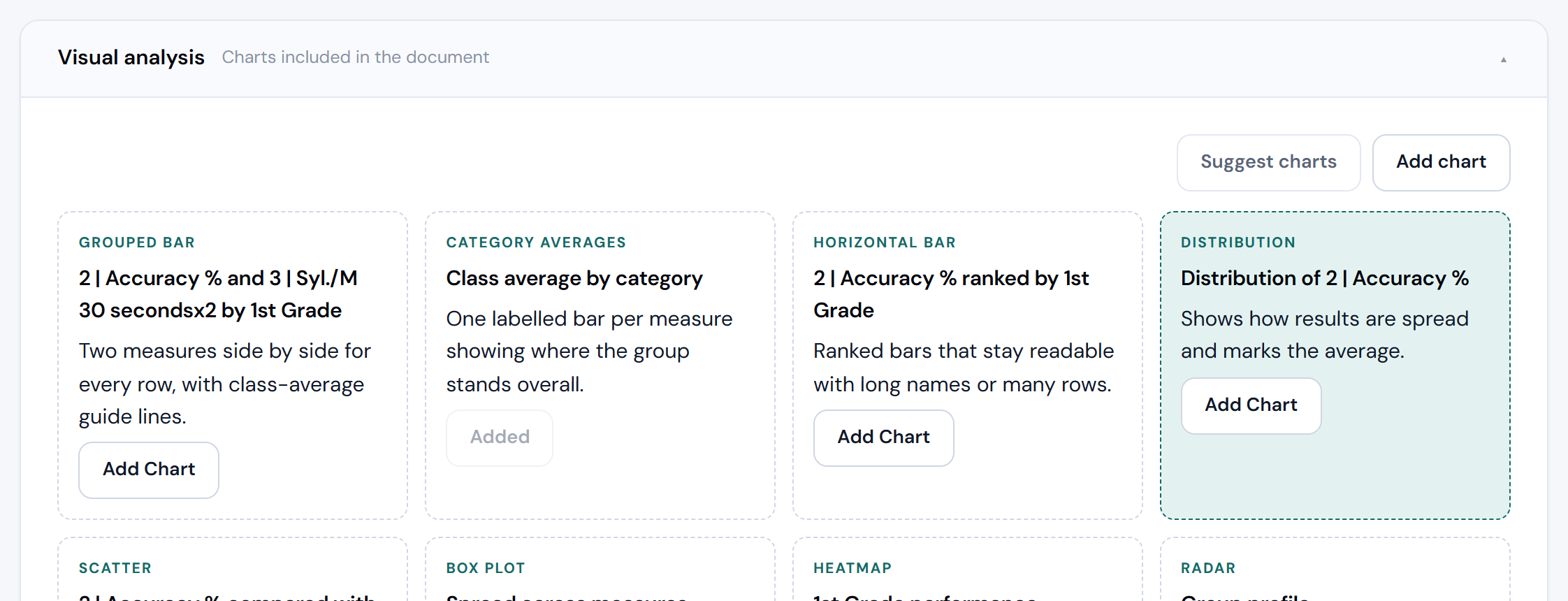
Press Suggest charts for sensible picks, or Add chart and choose from fifteen styles — bars, distribution, heatmap, radar and more. Preview any chart before it goes in.
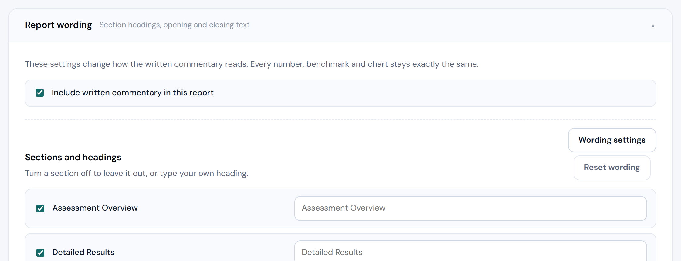
Turn written sections on or off, rename any heading, and add your own opening and closing paragraphs. The numbers, charts and targets never change — only how the report reads.
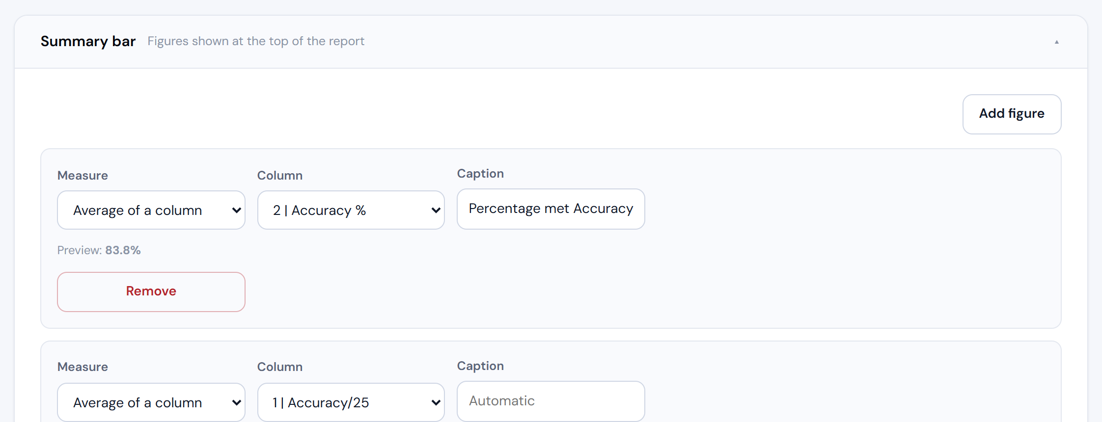
Choose the headline figures printed across the top — students assessed, an average, how many met a target — and add a note that prints in a highlighted box under the table.
Last details, then the download. The file lands wherever your browser saves downloads and opens straight in Word.
Want a second view of the same marks? Go back to step 3, switch the report type, and generate again. Your data stays loaded.
Do it once, reuse it forever
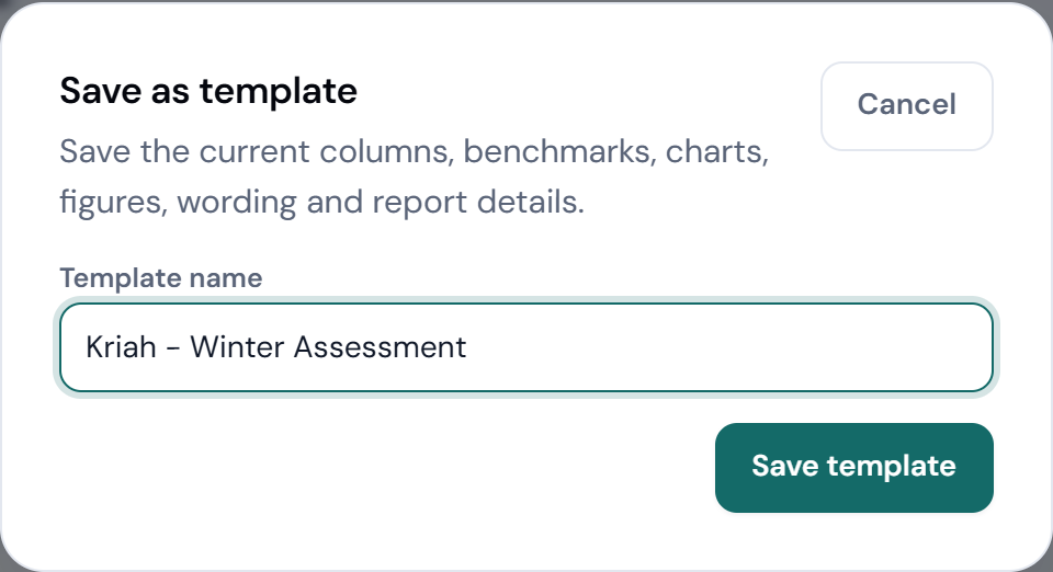
A template is the memory of one assessment: its columns, targets, charts, headline figures and wording. Set it up once and every future term is upload → generate.
Columns, benchmarks, charts, summary figures, wording and report details are all captured. Your students’ marks are not.
Worth knowing
From step 4 you never have to reach for the mouse. Esc closes any dialog.
The two buttons at the top right switch the theme and tighten the spacing. Your choice is remembered.
Suggest charts reads your columns and proposes charts that actually suit the data. Keep the ones you like.
Set a column’s direction to neutral and it still prints, but it is never called a strength, a priority or a target.
Comments and reference codes can be excluded from charts while staying in the results table.
Students are paired across assessments by name, so consistent spelling is all the linking you need to do.
Questions
Nowhere. Report Studio runs on this computer, builds the Word file locally, and hands it straight back to your browser.
Because the columns are not comparable: a percentage, a count of mistakes and a time in seconds cannot be averaged into one honest number. Each category is reported on its own terms instead.
Growth needs a student in at least two assessments. Anyone appearing once is listed in the coverage panel on step 3 so you can check the spelling of the name.
Bars always read from zero upwards, so a longer bar simply means a bigger number. Direction is carried by the colour, the “lower is better” label and the benchmark line.
Open the template editor and check the advanced import settings — the first and last heading rows and the first data row — then re‑import.
Yes. The output is a normal .docx, so every table, heading and chart can be adjusted in Word before printing.
Pick a template, drop in this term’s marks, and let it write the report.